UX design
Our priority is to test the design from start to finish. First, we provide a design prototype that undergoes thorough user interaction testing with a test group.

The principle of minimalism: less is more
When we work on the interface, we always remember that minimalism is not only a trend but also a necessity for user convenience. An excessive number of elements can be confusing and complicate the interaction process.
Less is more. We remove everything unnecessary and focus only on key user actions.
How this affects conversion: The simpler and more intuitive the interface, the faster users will find the information they need and perform the desired action, whether it be a purchase, registration, or subscription.
Example: When a website has too many buttons that are identical in color and shape, it can cause confusion. We always highlight important elements so that they immediately attract attention.
Logical navigation and user journey
The user journey is how users interact with your product. We always make sure that this journey is logical and not confusing.
Navigation should be simple and intuitive. We place interface elements so that users can easily navigate the site or application without wasting time.
How this affects conversion: When users quickly find the information they need or perform the necessary action, the likelihood of completing a purchase or registration increases significantly.
Example: We always place “Checkout” buttons in convenient locations so that users don't waste time searching for them and can proceed to checkout immediately.

Visual cues and accents
We always use visual cues to guide users and highlight important interface elements. This helps make a website or app not only user-friendly, but also effective.
We use contrasting colors and animated prompts to draw attention to key elements such as buttons or forms.
How this works for conversion: When users see where they need to click and receive prompts at every step, the likelihood of successfully completing the target action increases.
Example: Bright animations on the “Add to cart” buttons or color highlighting of important elements allow users to easily navigate and take action.
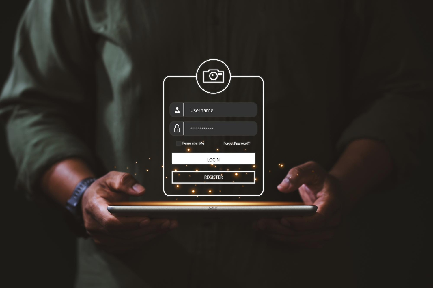
Simple and straightforward registration and ordering process
The registration and order placement process is an important part of interacting with the website. We strive to make this process as simple and straightforward as possible so that users do not encounter any difficulties.
Remove unnecessary fields from forms and use steps to simplify the process.
How this affects conversion: The easier and faster users can register or make a purchase, the higher the likelihood of completing the action.
Example: Instead of asking the user to enter all the data at once, we divide the form into several steps to make the process easier and not overwhelm the user.

Page loading speed
We always remember that website loading speed is not just a technical aspect, but also a factor that affects how users perceive our product.
We optimize images and minimize the use of heavy scripts to improve loading times.
How this affects conversion: If a website or application loads too slowly, users may leave the page before it finishes loading. Fast loading helps retain users and increases the likelihood that they will complete their action.
Example: We always optimize images so that the website loads quickly and without delays, which improves the user experience.